1) Something that caught my eye while looking at his photographs is that he takes photos of things that you wouldn't see everyday. Something particular that I like about this photos is that he takes a lot of photos of people off guard and it really does look like there off guard.
2) I see in one of my photos that a guy is laying on his bed looking up smoking, in his room there are pictures of girls hanging on his wall. In the other picture I see a line of little kids pulling on each other it looks like there following each other so they won't get lost. The little kids are outside crossing the street in front of a bunch of cars.
I smell the smoke of the cigarette the guy is smoking. His whole room smells like smoke and its not that great of a smell. My clothes are starting to smell like smoke. In the other photo it smells like outside and I smell the smoke from the car engines.
I hear the guy blowing out the smoke when he inhales it. I also hear him coughing every time he puts the cigarette in his mouth. In the other photo I hear the kids talking loud because there outside. I hear the cars honking because the kids are holding up traffic
I taste the smoke going into my throat every time I breath.
Wednesday, October 23, 2013
Monday, October 21, 2013
Mural Project Review
1. A theme that I can use for my school is education. I would use education by trying to influence people that education is important for everyone.
2. I would capture people working on math, science, reading and history. Not only in academic classes but also in your elective classes. Especially in there Academy classes. I think that other people would care about this theme because some people do want to be successful and have a good career when they get older.
3. Advantages of using a phone camera for this project is that you can take the picture and immediately post it on Instagram unlike a probable camera. Disadvantages of using a phone camera is that not all phone cameras have good quality.
4. Advantages of using a SLR camera is that the quality of the camera will come out good unlike some phones. Disadvantages of using a SLR camera is that you can't immediately post the picture you took on Instagram.
5. I think that we should use SRL cameras because I don't think that everyone has a phone camera they can use.
Thursday, October 17, 2013
Academics Shoot
Simplicity
1. This photo will fit well with this rule because the background is plain.
2. The background makes the image of the man pop out because of the background being plain and simple.
3. Yes.
4. I could've done it differently by following the rule of Simplicity.

Lines
1. Well because there are lines in the picture.
2. The lines of the poles outside go with the rule.
3. Yes because there are lines in the picture.
4. Things I could've done differently is that get the lines on the poles on each side.

Rule of thirds
1. Well.
2. The girls in the picture look like the still are walking a lap around the track.
3. Yes because it does look like the girls in the picture are walking the track.
4. I could've done things differently by following the Rule of Thirds.

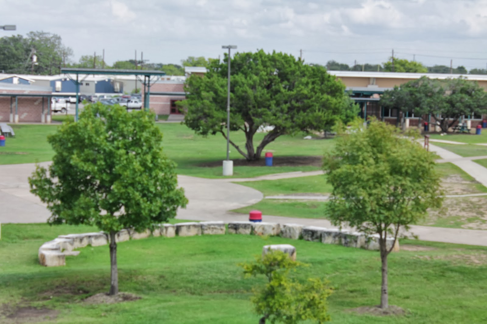
Balance
1. Very well.
2. In the picture the three trees give the picture balance because they aren't lined up
3. Yes because the trees are kinda chimerical.
4. I could've followed the rule of Balance if I didn't follow the rule well.
Avoiding Merges
1. Kinda well
2. In the picture looks like part of the door is going into the boys head.
3. Kinda only because it doesn't really look like the part of the door in going into the boys head.
4. Things I could've done differently is the I could've token the picture up closely.

Friday, October 4, 2013
Academics Shoot Preview
The Story

I think that this has a story too the picture because the kids are doing a good thing by feeding these people that don't have food.
Action and Emotion

This has a lot of action because there doing an experiment and it exploded and the person who took the picture actually got to capture it. It also shows emotion by the peoples facial expression of the explosion.
Filling the Frame

This photo is "filling the frame" because the people in the photo are creating the photo and it makes the picture stand out with all the people in the photo.

I like this photo because even though the picture is dark it still shows what she's doing and she probably had to stay like this for a while so they could get a good picture. This photo follows under simplicity because the background is a solid color and it gets the picture.
1. In the dance room
2. The dance room or an elective class.
3. Make sure that what I'm taking is clear and stay focused.
Wednesday, October 2, 2013
Elements of Art Principles of Design
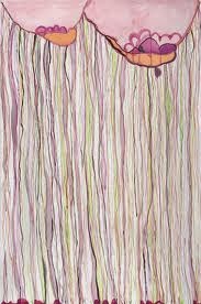
Color - show the primary colors, secondary colors, and the tertiary (intermediate) colors. They also show the relationships between complementary colors.

I picked this painting for color because this painting has a bunch of different colors.

Line - marks made by a pointed tool: brush, pencil, pen, etc. Lines can vary in width, direction, curvature, length, or color.

I picked this painting for lines because it has a lot of them on the building.
 I picked this photo for lines because it has a lot of lines and the lines are very thin and detailed.
Shape - formed wherever the ends of a continuous line meet.

I picked this painting for shape because it has a lot of shapes in this picture.

Value (Tone) - refers to dark and light; the value scale refers to black and white with all gradations of
gray in between.Value contrasts help us to see and understand a two-dimensional work of art.

This painting I picked for value because it goes from back to light colors.
Form - describes objects that are three-dimensional, having length, width, and height.

I picked this painting for form because the painting is showing a three-dimensional shape, a sphere.
Texture - can be rough, bumpy, slick, scratchy, smooth, silky, soft, prickly--the list is endless. Texture refers to the surface quality, both simulated and actual, of artwork.

Space - refers to distances or areas around, between, or within components of a piece.

dark.
Balance - is the comfortable or pleasing arrangement of things in art. There are three different types of balance: symmetrical, asymmetrical, and radial.

Contrast - is created by using elements that conflict with one another. Often, contrast is created using complementary colors or extremely light and dark values. Contrast creates interest in a piece and often draws the eye to certain areas. It is used to make a painting look interesting.

Emphasis - the focal area of an artwork gives it importance. An artist may stress some elements of the design over others. The eye of the viewer will focus on the area of emphasis or center of interest first, then take in the rest of the composition.

Movement - an artwork means the artist is taking viewers on a trip through the work by means of lines, edges, shapes, and colors often leading to the focal area.

I picked this painting because the lines on the waves caught my eye.
Pattern - are made in art when the same shapes or elements are repeated again and again. Pattern uses the elements of art in planned or random repetitions to enhance surfaces of paintings or sculptures.

I picked this painting because it has same shapes repeating it's self.

I picked this painting because it has same shapes repeating it's self.
Rhythm - is the repetition of shapes, lines, and forms. Rhythm is a movement in which some elements recurs regularly. Like a dance, it will have a flow of objects that will seem to be like the beat of music.
 I picked this painting because it does have a lot of rhythm to it. The way the lines are and how it blends in with each other makes it have rhythm.

Unity - means that all elements in an artwork are in harmony. Unity brings together a composition with similar units.
 I picked this painting because it has the same shape which is a triangle.

Subscribe to:
Posts (Atom)